MediaQuery
One of the most common questions asked by beginners in Flutter help channels is “How do I make my widget responsive?” or “How do I make my UI look the same on all devices?” and the most common answer is to use MediaQuery or a similar package that sizes widgets based on a fraction of the screen size.
In this article we will break down common misconceptions that led to MediaQuery, unfortunately, becoming so common, and why fractional sizing is bad practice in general.
In 5+ years of developing Flutter apps professionally I have never seen a good reason to use MediaQuery.of(context).size.width * 0.6 to size a widget. In fact, it directly hurts accessibility and causes more layout problems than it solves, it’s always better to use the powerful built-in layout widgets and breakpoints.
This applies to not just MediaQuery but also the popular sizer, responsive_sizer, and flutter_screenutil packages, which change the size of widgets proportional to the size of the screen.
Make your app look the same on all devices
Responsiveness is all about how your layouts adapt to the strengths and weaknesses of the device.
I’ve created a news app to illustrate why fractional scaling is usually not desirable in practice. If we use a package like sizer to scale the whole app we end up with something like this:
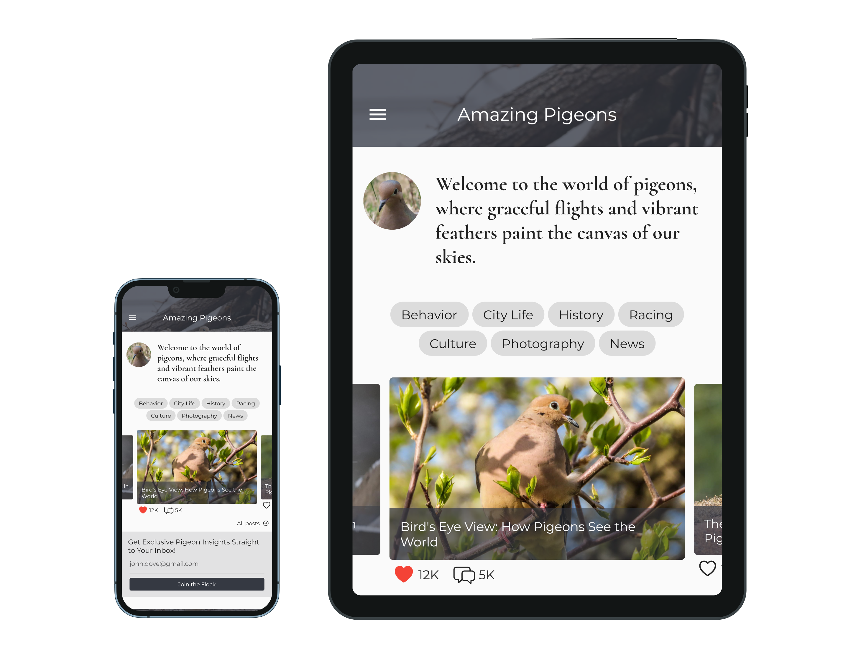
Everything now has the same relative size but is waaay too big on the tablet, the app bar, text, and buttons take up twice as much space as a native application. The difference in aspect ratio also leads to less content visible on the tablet, yuck!
If we remove fractional sizing and use built-in layout widgets instead, we get something much more accessible:
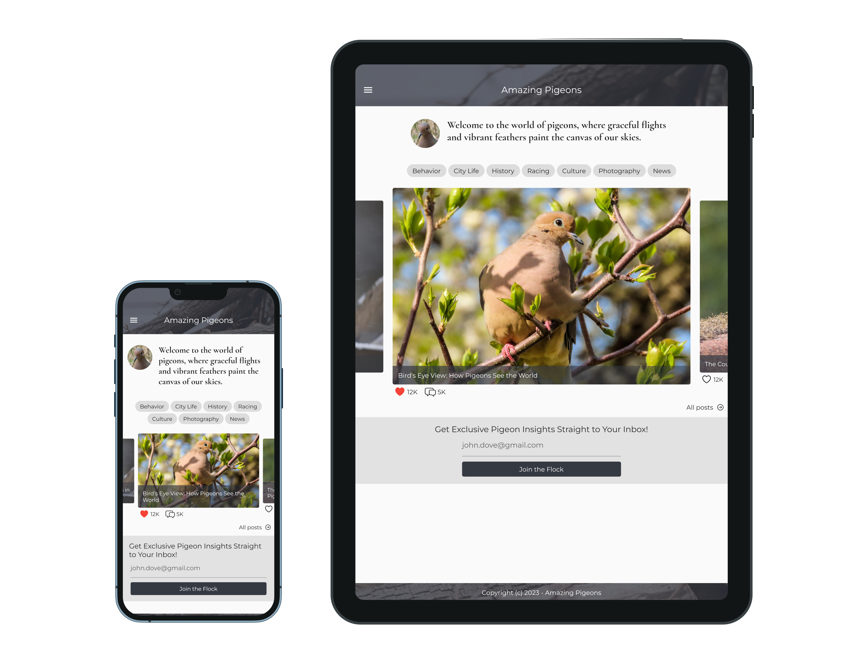
Notice that text and padding is a very similar size between the two. This works as intended without any special tweaks, Flutter (just like native apps) use a pixel scaling factor set by the device manufacture which ensures text and other UI elements are a similar physical size regardless of platform.
The layout of Amazing Pigeons adapts to different viewport dimensions in a few ways:
- Padding is automatically applied to the AppBar to keep system elements out of the way.
- The welcome text uses a combination of SizedBox, Row, and Expanded to let the text wrap on small displays and not look too wide on bigger ones.
- The Wrap widget is used to distribute tag chips according to how much space is available.
- The carousel uses an AspectRatio to prevent images from being smushed on big or small screens.
- The carousel tiles use a Stack to overlay text while still allowing it to wrap, supplying the left/right parameters to Positioned ensures the text can wrap.
- Just like the welcome text, the “Join the Flock” button and its accompanying text field are wrapped in a SizedBox and Center to ensure it isn’t too wide.
- Everything is wrapped in a ListView so we can add more content vertically without overflowing.
Understanding Flutter’s layout protocol and getting in the habit of applying these techniques is worth it, most of the time you don’t need to think about overflows or screen sizes, just let the framework do its thing.
How to prevent overflow errors
A common complaint of static sizes is that it can cause overflows, this is not a problem with static sizing but a symptom of building your UI around the idea that widgets size themselves without constraints.
Here is a typical use of MediaQuery, it’s a button that takes up 80% of the screen with a 8:1 aspect ratio:
SizedBox(
  width: MediaQuery.of(context).size.width * 0.8,
  height: MediaQuery.of(context).size.width * 0.1,
  child: ElevatedButton(
    onPressed: () {},
    child: const Text('Do a Thing'),
  ),
),
Most devices are around 400 logical pixels wide, so we translate that to 350 x 45:
SizedBox(
  width: 350,
  height: 40,
  child: ElevatedButton(
    onPressed: () {},
    child: const Text('Do a Thing'),
  ),
),
Now that it has a static size you might see an overflow error on small devices:
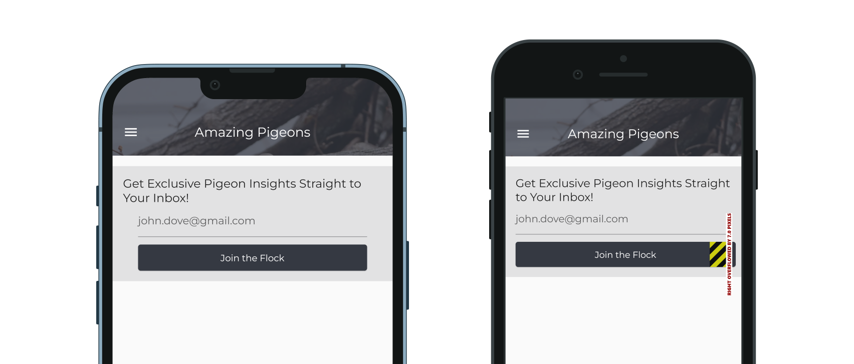
A common misconception here is that the button is trying to be too wide and needs to size itself smaller, but that isn’t true. The real problem is that the button was not constrained by its parent.
In this case, the overflow error is being generated by a parent Row that was used to center the button, and the solution is very simple, just wrap the row’s immediate child in a Flexible:
Row(
  mainAxisAlignment: MainAxisAlignment.center,
  children: [
    Flexible(child: SizedBox(
      width: 350,
      height: 40,
      child: ...
    )),
  ],
)
What Flexible does is tell the Row to give the child a maxWidth constraint, children are forced to follow the constraints given by their parent so there is no more overflow error. The width parameter being ignored is well-defined behavior, you can read more about it in my Introduction to Layout.
Wouldn’t text look too small on large screens?
Not at all. Widgets might consume a smaller fraction of the space but bigger displays also consume more of the user’s field of view.
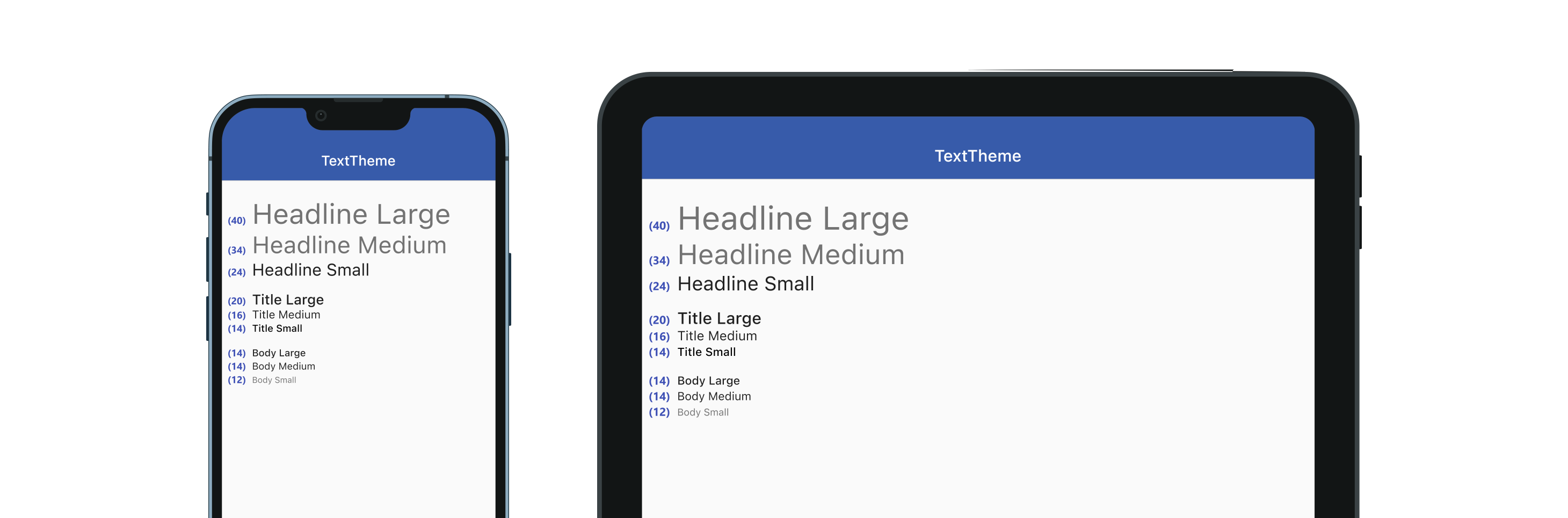
Text sizing is the most common thing app wireframes get wrong, it’s difficult to know what feels right until you’ve played with it on a physical device. Generally you should refer to the material guidelines described in TextTheme which puts body text at 14px:
If you still aren’t convinced, let’s look at a simple Google search on these two devices:

Google doesn’t seem to think 14px fonts are too small on tablets, and they have entire teams working on accessibility. Consistency with other apps leads to a better user experience and users can configure text sizes in system settings if they prefer it bigger or smaller.
What if it has to be pixel-perfect?
This excuse is often given when you were handed a design and told to implement it exactly as shown, a common situation that I can sympathize with. Perhaps this article will persuade you (or your teammates) to break out of the mindset of everything having to be pixel-perfect.
Building apps is always an iterative process. Both the wireframes and code are going to evolve over time as you get feedback or develop new features. Suggesting (and implementing) changes to a design is important part of that process, it might just require more effective communication.
The finished product is always going to look slightly different from what was envisioned, it’s up to you (the app developer) to make those differences positively impact the user experience.
Additional Q&A
- What were these device screenshots made with?
- I used the
device_framepackage to emulate the MediaQuery (including accurate viewport sizes) of common devices, they were scaled according to their precise physical dimensions, and thescreenshotpackage was used to actually capture and save the pngs.
- I used the
Updated October 19, 2023